A travel app built to help traveling families plan and enjoy successful and safe vacations.

A common design challenge seems to be: "design a mobile travel app," as the functionality and form required provides a good framework for learning the processes and tools of UX/UI. I wanted to take this challenge a step further by identifying a real problem people in my life encounter while traveling and solving it with my design.

Project Type: Mobile App Design
Timeline: 3 Week Sprint
My Roles: UX Researcher, UX Designer, UI Designer
Tools Used: Figma, Google Suite, Trello, Miro
Communicating with several acquaintances that have recently taken trips with their children and extended families revealed added obstacles to travel that singles don’t encounter or even consider. These communications also revealed a dearth of solutions and aids to alleviate these obstacles.
Trip-N-Tots was designed to be the simplest and most reliable way to give parents peace of mind on vacation. We have observed that other services in the market do not cater to the unique safety and scheduling needs of families while away from home. What resources in a concise and easy-to-use app can we provide to parents traveling with their families to ensure a smooth, safe, and satisfactory travel experience?
Taking the first steps into UX meant learning how to conduct solid research that would become the foundation of any potential designs. I began with formulating a research plan consisting of a questionnaire that asked parents about traveling with their families. I interviewed 3 of my coworkers that all have children and created a Google Forms survey that I sent to family and friends, and received 6 responses to.
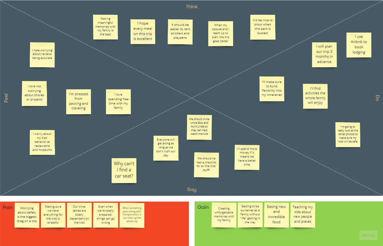
The respondents all had unique circumstances, but shared a few common frustrations, which informed my Empathy Mapping. Safety of any potential lodging and transportation came up frequently, as did the stress of packing and preparing for any unforeseen circumstances. Additionally, several interviewees said they preferred traveling with larger family groups; this way the adults could entrust the grandparents or siblings with the kids, affording some personal time on the vacation.
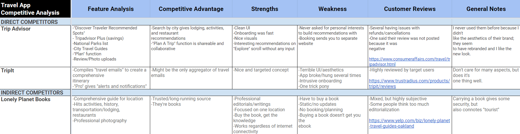
I then took a look at some other popular travel apps; none of them focused on families first:
Reflecting on these insights, I wrote a Value Proposition that served as the mission statement for the rest of my design:
Trip-N-Tots offers a comprehensive suite of tools to help traveling families plan and enjoy a successful and safe vacation.
We’re better because we understand the challenges your family faces.
We’re believable because we’re family.
Samantha is a working mother who loves travelling with her family, but finds booking trips stressful as she considers the safety of her children to be paramount. Transportation, scheduling, and packing are additional challenges she faces when planning vacations.

Brainstorming Features
Using the insights gained from my research and creating my potential user, I began brainstorming potential solutions that my app could incorporate to solve some of Samantha's pain points:
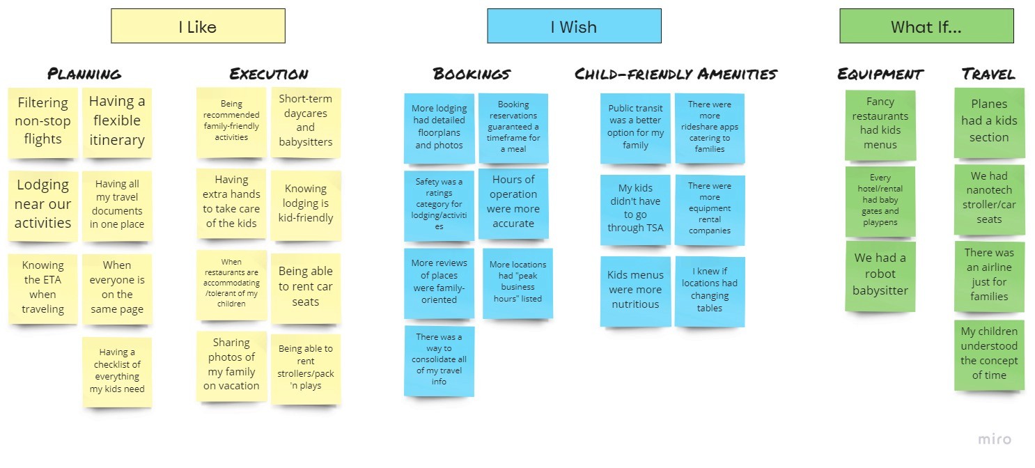
Next came weighing the feasibility of those possible features versus how much they would impact potential users:

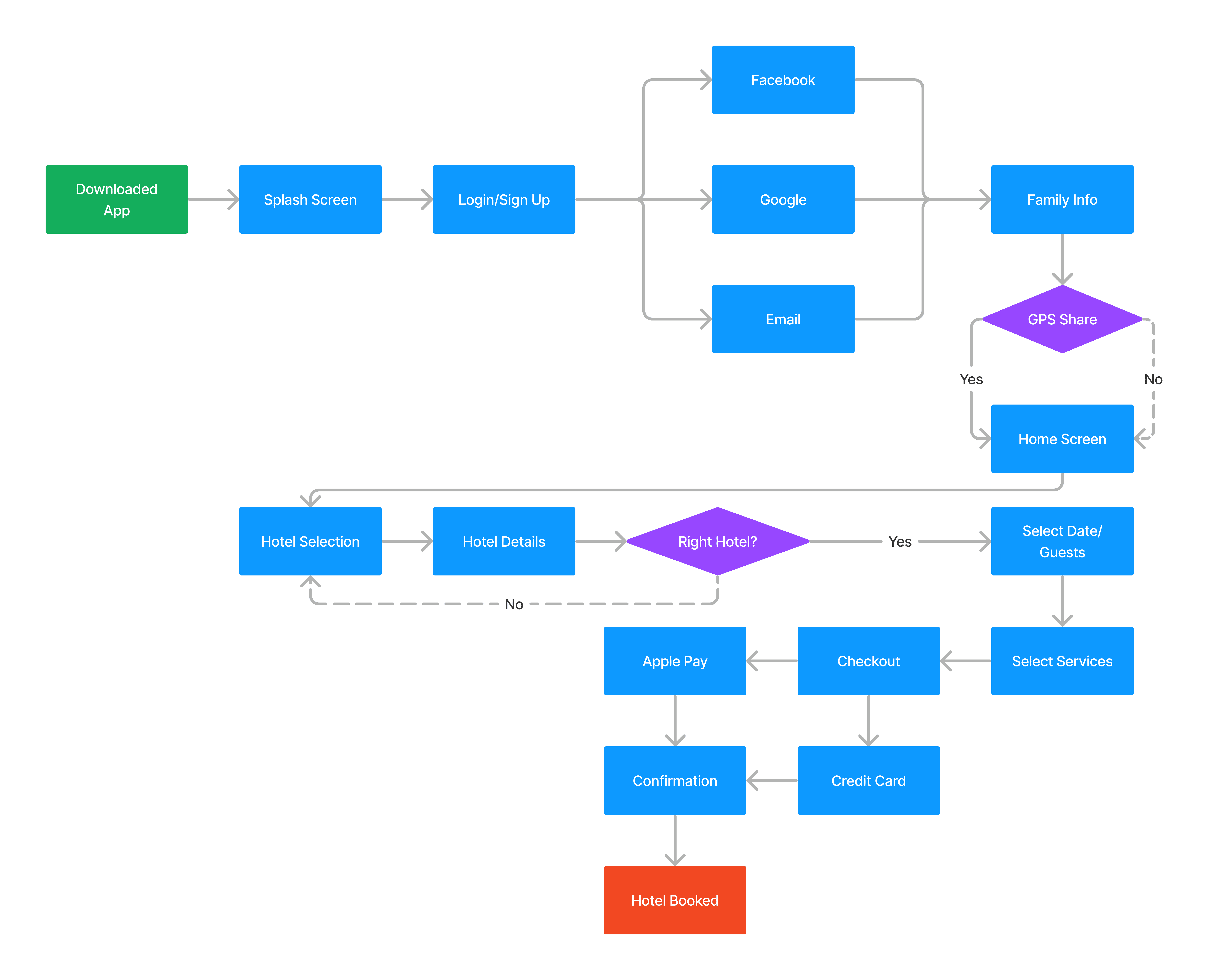
Having decided on what features I would implement in the app to help Samantha and her family, I next started laying out how she would actually utilize the app. All of the amenities, services, and equipment that Trip-N-Tots will provide to parents will appear in the "Select Services" screen, and the "Hotel Details" will, in copy, reviews, and rating, be geared towards parents.
This simple storyboard demonstrates how Samantha plans a trip with Trip-N-Tots, including finding activities for the family and child care equipment rentals.

Wireframes
In working through the wireframing for the proposed storyboarding/feature prioritization, it became clear that the scope of the features I was considering were going to be too broad for prototyping, at least initially. The features focused on are booking with a focus on family rating/review, recommended activities, and childcare equipment rental.

I ran four friends, all parents, through some Guerilla Testing, with their task being to book a hotel. The overall flow seemed intuitive to users. During the onboarding process, there was some confusion over a lack of a “New User/Sign Up” button, so that was included in the next iteration. There were also several back buttons that weren’t linked correctly, and the credit card checkout was broken on the first test.
It was also suggested that a legal disclaimer over the “safety” claims presented by user reviews be included, so a "Terms of Service" disclosure was included in the login/sign up screen.


Users also commented on some of the features that had buttons built, but were not fully functional, so several of those were removed to narrow the users focus. This was the result of some "scope creep"; I had clearly bitten off more than I could chew for my first attempt at designing an app.
At this point in the bootcamp, we hadn't covered design theory principles, so the styling from wireframe to mid-fidelity relied on previous graphic design experience.

iOS HIG principles and elements were incorporated into the mid-fidelity prototype presented here. Button, form field, and font sizes were standardized, SF Pro Font was implemented for all functional/non-flavor text, and status bar, date picker, and keyboard components were utilized.

As an introduction to the design process and the tools used in the UX/UI field, the growing pains and learning curve I experienced during this project yielded both a crash course in why to adhere to best practices, and discovering enjoyment of the design process and work.
Regarding the travel app development, I think that experiencing some “scope creep” was a good learning experience/cautionary tale. I was hoping to build a fully functional, one-stop shop app, which time and ability did not allow for; I’m satisfied with what I ended up producing, and think the flow, features, and functions are all solid.. I was also pleased by the response of parents I tested the app on; there appears to be a market for an app like this.